Jelly CARE
Problem
Jelly CARE sells kids’ jelly supplements through partners who buy stock in sets and resell it. The brief, written into the partner journey, was “pay and receive stock quickly and easily — for both admin and partner”. Partners needed to see what a set would earn them, pay without back-and-forth, and know where their order was; the admin team needed to check every transfer slip and ship every order without chasing details over Line.
 FIG. 04
 Pairing a bright, playful brand with a powerful ordering system — a fun website plus a partner back-office that is easy for partners to use.
- Back-office
- Orders, stock, delivery, warehouse, agents
- Order status
- 7 stages, one colour each
- Design system
- Its own — 546 component variants
- Partner credit
- Top-up, payment and history
Role & Approach
I was the only designer, on a tight timeline, so I put the effort where it unblocked development: a journey map for partner and admin, a system flow covering sign-up, credit, orders, shipping and billing, then the screens and a design system made for the back-office. I traded deeper user research for speed. Key decisions: show profit and investment on every set before purchase, keep mixing flavours, payment and slip upload on one page, block payment until invalid items are fixed, and give each of the seven order stages its own colour.
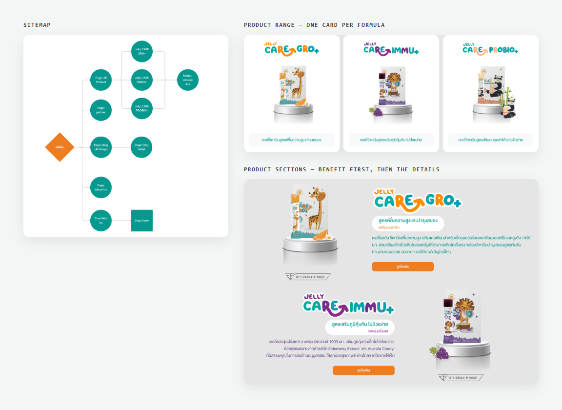 FIG. 05
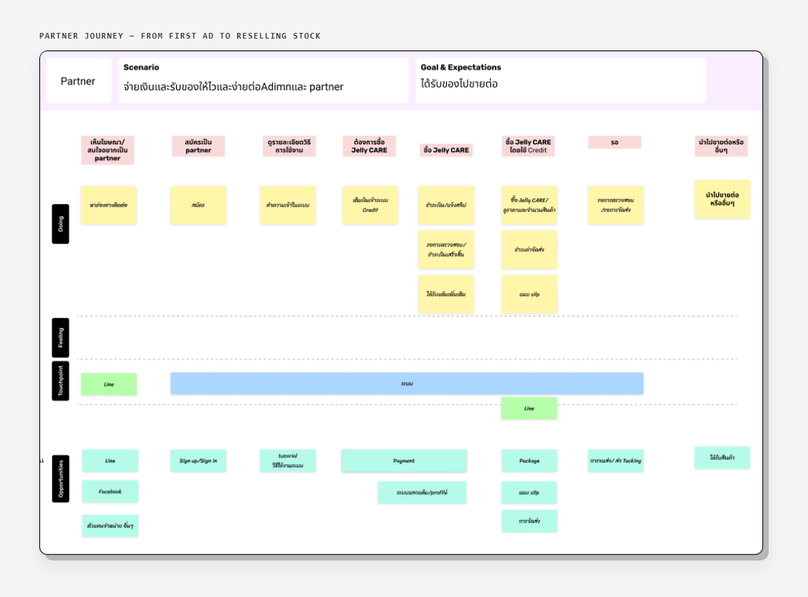 FIG. 06
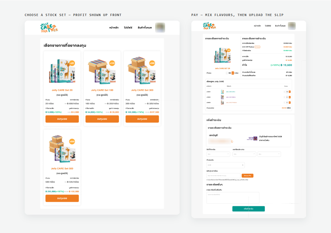 FIG. 07
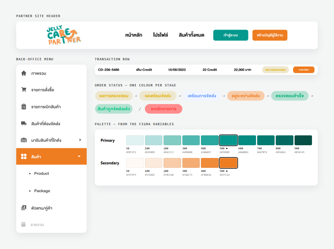 FIG. 08